One of the most underappreciated APIs in AWS is the Cost Explorer API - specifically the GetCostAndUsage API. In essence, this API lets you fetch the same information you can get through the Cost Explorer GUI - but without the difficult UI/UX.
This short blog post shows how you can leverage this programmatic access to the Cost Explorer to
quickly build up powerful visualizations of your AWS costs directly from the CLI - and all you
need is ce:GetCostAndUsage permissions.
API Usage
AWS's Cost Explorer isn't always simple to use, and neither is its underlying GetCostAndUsage
API. I think that example usages will be more instructive than textual explanations - indeed
AWS's documentation is rich in text but poor in examples so it'll be nice to complement it.
Tip
AWS's Cost Explorer directly uses this API for its functionality, so if you ever want to form these commands with a GUI you can use Cost Explorer and extract the payloads using your browser's development tools.
Let's go over some examples:
-
See the previous two months' cost grouped by service on monthly granularity:
START_DATE=$(date --date="2 months ago" +%Y-%m-%d) # e.g. 2024-03-17 - inclusive start date END_DATE=$(date --date="tomorrow" +%Y-%m-%d) # e.g. 2024-05-18 - exclusive end date aws ce get-cost-and-usage \ --time-period Start=$START_DATE,End=$END_DATE \ --granularity MONTHLY \ --metrics "AmortizedCost" \ --group-by "Type=DIMENSION,Key=SERVICE"- You can replace
MONTHLYwithDAILYfor daily granularity.- AWS also supports
HOURLYgranularity, but only for the last 14 days, and it is an opt-in feature.
- AWS also supports
- Replace
SERVICEwith any ofAZ,INSTANCE_TYPE,LEGAL_ENTITY_NAME,INVOICING_ENTITY,LINKED_ACCOUNT,OPERATION,PLATFORM,PURCHASE_TYPE,SERVICE,TENANCY,RECORD_TYPE, orUSAGE_TYPE.
And here's a useful conversion, toggled away for brevity:
- You can replace
-
See how many gigabytes were transferred between availability zones last month, and how much it cost you:
START_DATE=$(date --date="1 month ago" +%Y-%m-%d) END_DATE=$(date --date="tomorrow" +%Y-%m-%d) aws ce get-cost-and-usage \ --time-period Start=$START_DATE,End=$END_DATE \ --granularity MONTHLY \ --metrics "AmortizedCost" "UsageQuantity" \ --group-by "Type=DIMENSION,Key=USAGE_TYPE" \ --filter '{ "Dimensions": { "Key": "USAGE_TYPE", "Values": ["DataTransfer-Regional-Bytes"], "MatchOptions": ["EQUALS"] } }' -
See how many gigabytes were sent out to the Internet last month from S3, and how much it cost you - and exclude credits:
START_DATE=$(date --date="1 month ago" +%Y-%m-%d) END_DATE=$(date --date="tomorrow" +%Y-%m-%d) aws ce get-cost-and-usage \ --time-period Start=$START_DATE,End=$END_DATE \ --granularity MONTHLY \ --metrics "AmortizedCost" "UsageQuantity" \ --group-by "Type=DIMENSION,Key=USAGE_TYPE" \ --filter '{ "And": [ { "Not": { "Dimensions": { "Key": "RECORD_TYPE", "Values": ["Credit"] } } }, { "Dimensions": { "Key": "USAGE_TYPE_GROUP", "Values": ["S3: Data Transfer - Internet (Out)"] } } ] }' -
See the previous two months' cost grouped by region and service:
Note
As of writing, multiple dimensions when grouping is not available in the Cost Explorer GUI. This is a relatively uncommon case of AWS functionality available only through APIs and not through the AWS Console.
Warning
As of writing, this API supports a maximum of two dimensions when grouping.
START_DATE=$(date --date="2 months ago" +%Y-%m-%d)  # e.g. 2024-03-17 - inclusive start date
END_DATE=$(date --date="tomorrow" +%Y-%m-%d)        # e.g. 2024-05-18 - exclusive end date

aws ce get-cost-and-usage                               \
        --time-period Start=$START_DATE,End=$END_DATE   \
        --granularity MONTHLY                           \
        --metrics "AmortizedCost"                       \
        --group-by "Type=DIMENSION,Key=REGION"          \
                   "Type=DIMENSION,Key=SERVICE"
Quick Visualizations
Now that we know how to utilize this API, we can leverage it for quick-but-powerful visualizations. For instance, we can run this Python code to generate a pie chart of our cloud costs grouped by services:
import boto3
import datetime
import matplotlib.pyplot as plt
import seaborn as sns

client = boto3.client("ce")

end_date = datetime.date.today().replace(day=1)
start_date = (end_date - datetime.timedelta(days=1)).replace(day=1)

response = client.get_cost_and_usage(
    TimePeriod={
        "Start": start_date.strftime("%Y-%m-%d"),
        "End": end_date.strftime("%Y-%m-%d"),
    },
    Granularity="MONTHLY",
    Metrics=["AmortizedCost"],
    GroupBy=[{"Type": "DIMENSION", "Key": "SERVICE"}],
    Filter={
        "Not": {
            "Dimensions": {
                "Key": "RECORD_TYPE",
                "Values": ["Credit"],
            }
        }
    },
)

services_to_costs = {
    item["Keys"][0]: float(item["Metrics"]["AmortizedCost"]["Amount"])
    for item in response["ResultsByTime"][0]["Groups"]
}

total_cost = sum(services_to_costs.values())

services = [
    service
    for service in services_to_costs
    # Services that cost less than 2% of the total cost will be aggregated later
    if services_to_costs[service] / total_cost > 0.02
]
other_services = set(services_to_costs) - set(services)

costs = [services_to_costs[service] for service in services]

if other_services:
    services.append("Other")
    costs.append(sum(services_to_costs[service] for service in other_services))

plt.pie(costs, labels=services, colors=sns.color_palette("pastel"), autopct="%.0f%%")
plt.show()
Which will generate something that looks like:
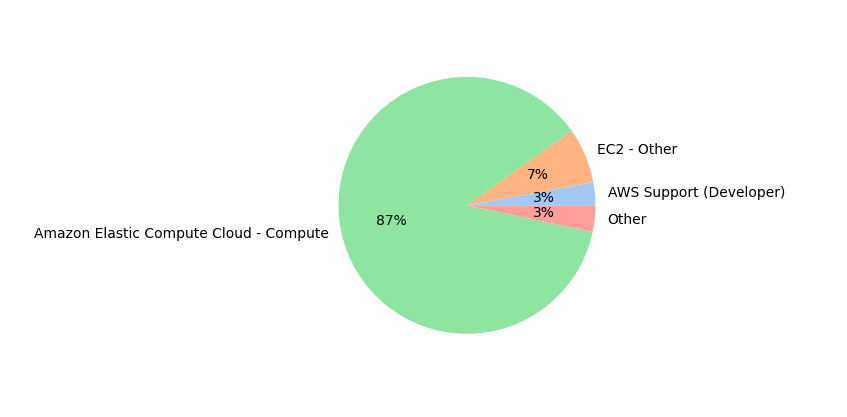
(I chose to only display percentages, but you could easily add dollar amounts)
And this Python code for a graph of daily AWS costs:
import boto3
import datetime
import matplotlib.pyplot as plt
import pandas as pd
import seaborn as sns

client = boto3.client("ce")

end_date = datetime.date.today().replace(day=1)
start_date = (end_date - datetime.timedelta(days=1)).replace(day=1)

response = client.get_cost_and_usage(
    TimePeriod={
        "Start": start_date.strftime("%Y-%m-%d"),
        "End": end_date.strftime("%Y-%m-%d"),
    },
    Granularity="DAILY",
    Metrics=["AmortizedCost"],
    Filter={"Not": {"Dimensions": {"Key": "RECORD_TYPE", "Values": ["Credit"]}}},
)

data = [
    {
        "Date": result["TimePeriod"]["Start"],
        "Cost": float(result["Total"]["AmortizedCost"]["Amount"]),
    }
    for result in response["ResultsByTime"]
]

df = pd.DataFrame(data)
df["Date"] = pd.to_datetime(df["Date"])

sns.set_theme(style="darkgrid")
plt.figure(figsize=(12, 6))
lineplot = sns.lineplot(
    data=df, x="Date", y="Cost", marker="o", linestyle="-", color="blue"
)
plt.title("Daily AWS Costs", fontsize=16)
plt.xlabel("Date", fontsize=14)
plt.ylabel("Cost ($)", fontsize=14)
plt.xticks(rotation=45)
plt.tight_layout()
plt.show()
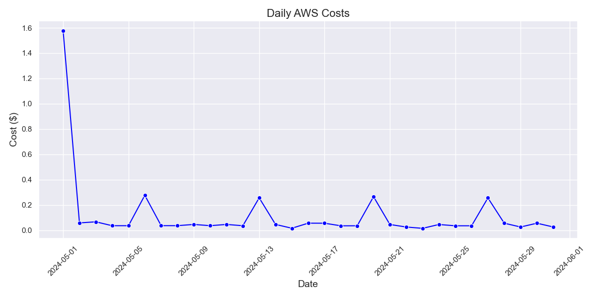
These are just two small examples - but they're two small examples that showcase visualizations and flexible display options that are either not possible or very tricky to accomplish in Cost Explorer.
Let's finish up with some conclusions:
Conclusions
We saw how GetCostAndUsage can give us deep visibility into our AWS costs and allows us to create
any visualizations we want. We can use this API as part of periodic reports, dashboards, or
whenever we want to go beyond the fairly limited visualizations that Cost Explorer supports.
Tip
To the Excel power users among you (I envy your powers) - Cost Explorer has a "Download as CSV"
feature that allows you to use standard spreadsheet programs for your visualization and analysis
purposes. You can similarly use GetCostAndUsage responses to create these CSVs.
We've gone over maybe the most fundamental cost analysis tool in AWS - Cost Explorer, and its underlying API - but this blog post is just barely scratching the surface of the cost analysis/visualization capabilities that are possible in AWS. I hope to go over additional possibilities in future posts, but for now thanks for reading and I hope you enjoyed!